Envisioning a Student Information System Chatbot

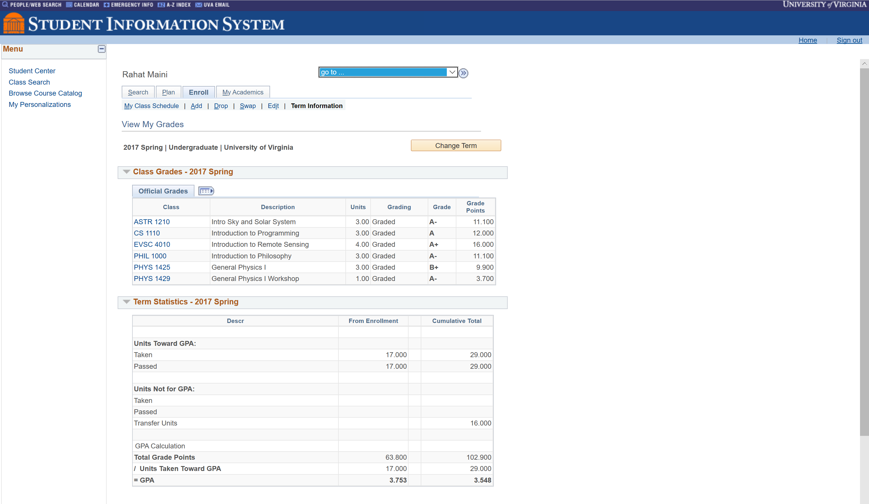
With UIs getting more and more complex and layered (especially legacy UIs that get new features padded on, often with no design team overseeing the process), it can be difficult to make the experience an enjoyable one. A rethinking of the whole design to incorporate new features and ideas that have been added is not easy to do (and not a scalable approach). For portals that rely more on the "hunt-and-pick" method of interaction, where users know what they are looking for or what they want, just not where it is, a complex UI is a burden. Maybe a search function is a remedy in some cases. Discovery of new features and tools is not really the focus of these UIs, making the already well-known features accessible and available is. I cannot think of a better application for a chatbot user interface than a complicated UI in need of human-centric design.

Chatbots and conversational UIs have been invading our lives recently, whether in the form of a voice assistant on your phone, a chatbot in a messaging app, or the Alexa in your home. It's trendy, but rarely applied the best way it can be. In this case, it is a perfect user interface. Most of the tasks performed in a student information system (getting grades, finance information, transcripts, signing up for classes) can be easily explained by a natural language query. In such a system, there are no menus, submenus, buttons, or any of that mess. The user knows what they would like done, and they instruct their application to do so, naturally.
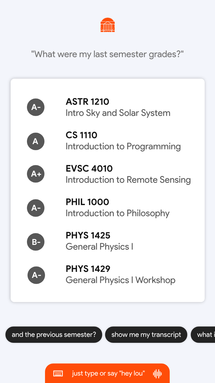
In the above mockup, you may notice a few things. The only real buttons are suggestions for additional queries, likely AI powered to know what users usually request next or what might be the next logical task or information in the system to retrieve at that moment. Also at the bottom you may notice the "hey lou" voice wake word, should the user want to use speech to interact with the bot (affectionately named Lou, a 1 in 49581 people name, easy to enter the vernacular of a school to refer to the application exclusively). The rest of the mockup is self-explanatory, and it is easy to imagine further applications of this kind of UI and the use cases it enables.