Exploring the Philips Wake-up Light
The Philips Wake-up light is something of a retrofuturistic device, an alarm clock designed for the future by people living in an earlier era. The concept is simple, replicate a sunrise anywhere from 20-40 minutes before your alarm to wake you up naturally, with gentle sounds playing as the alarm. This post is not about the effectiveness that Philips claims for this clock in waking you up, it is instead a dive into the industrial design and user interaction model of this product. In a time when even Philips has seemingly moved on with its Hue line of bulbs, relegating “sunrise wake-up” to a feature meant to be toggled inside an app, how does the $140 Wake-up light stack up?
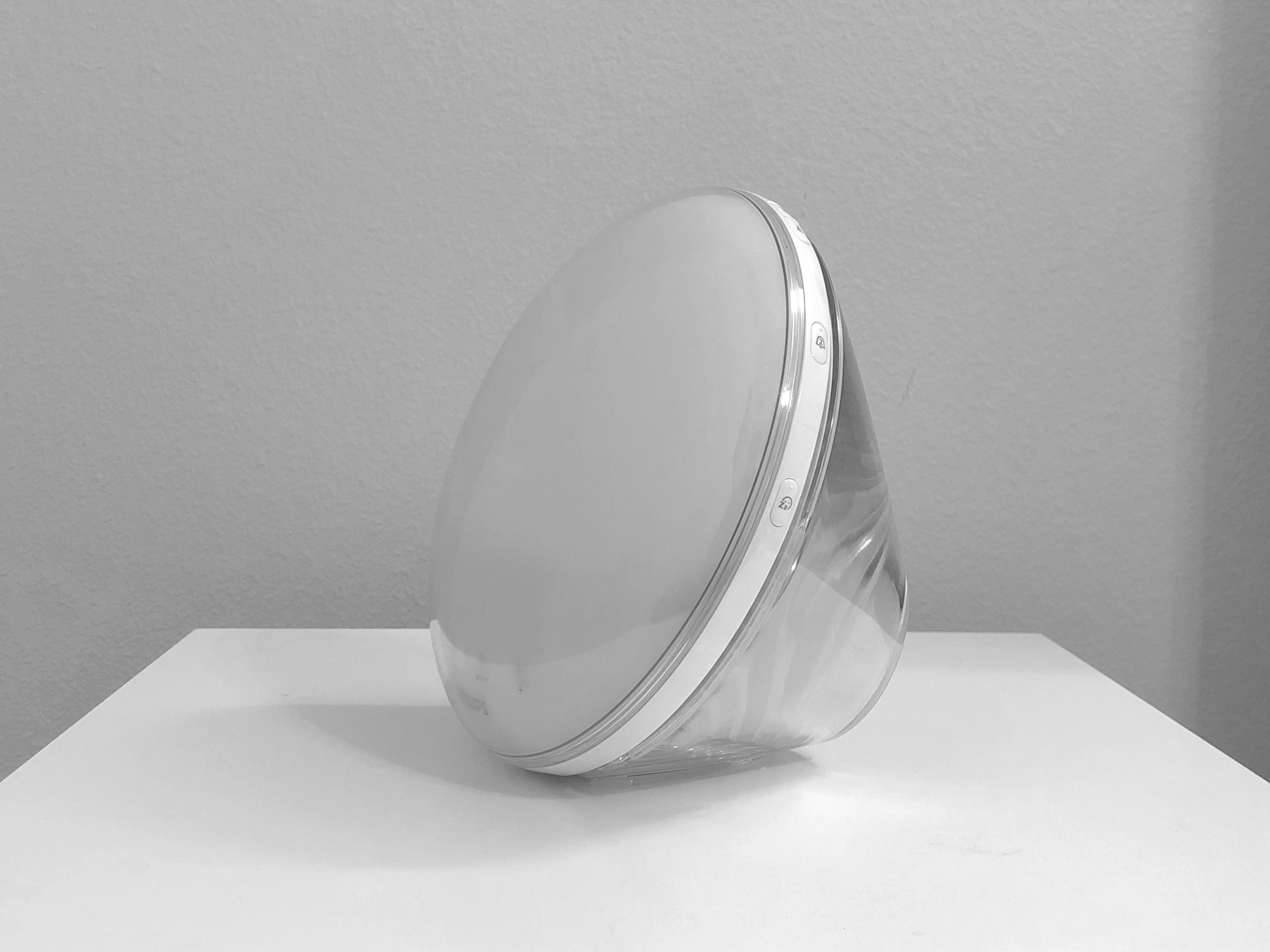
The Philips Wake-up light is a handsome product. The dualshot plastic body is more sophisticated than a basic matte or glossy solid color plastic finish and appears more apt to a device meant to be used in the home than a textured/patterned surface (a la Jawbone). It is complemented perfectly on the front face of the clock with the same dual-shot design. The whole device seems to be one contiguous body with only the ring of buttons acting as the unsightly seam (more on that later). Apparent in this photo another unsightly element of the product, the unusually long and wiry FM antenna. Perhaps a better design choice would’ve been to construct the white plastic band around the clock out of metal and use that as an antenna, but perhaps they had their reasons not to do so.
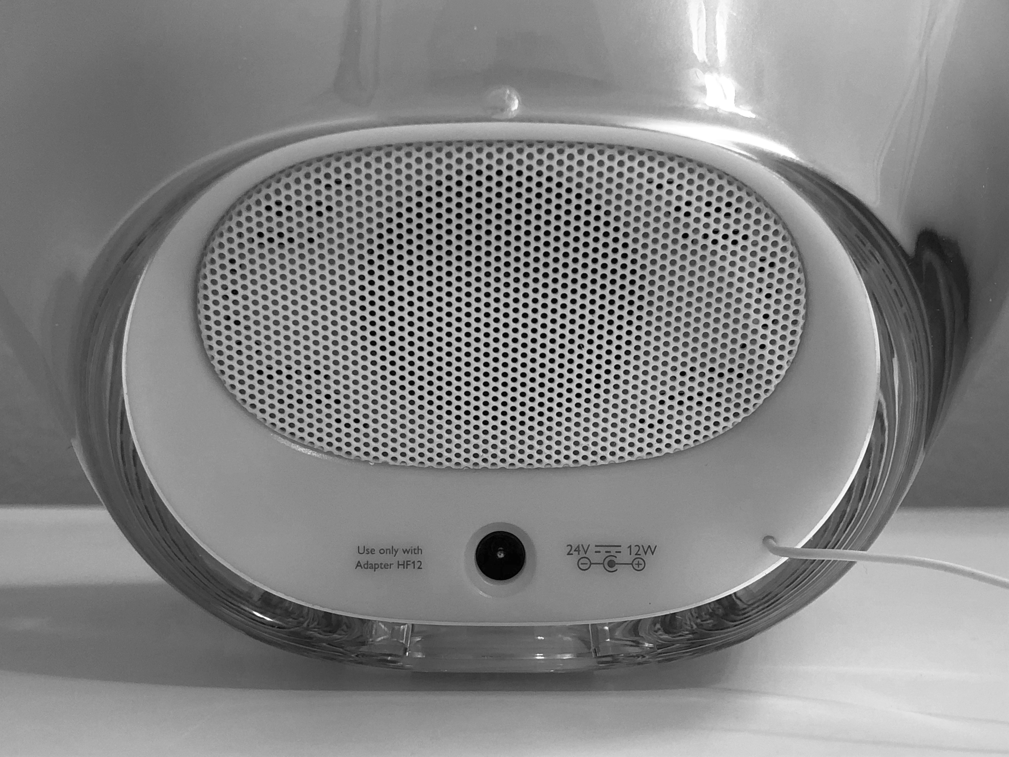
On the back of the product, the infuriatingly placed speaker grill can be seen. For some reason unknown to me, companies continue producing devices with speakers that do not face their users. In doing so (especially depending on what may reside behind the device) the audio is muffled or lower than anticipated. Placing the speaker perhaps on the bottom front face of the clock would have been greatly appreciated, with laser drilled holes as opposed to the massive boombox-style grill we have now. This shot also gives a better look at how light plays with the dual shot plastic body, very well. The back is unfettered from buttons or switches, thankfully, and just houses a proprietary power plug (a fine decision, as the power input needed for this thing likely exceeds what a regular USB-C power source provides, and that market remains too fragmented to bother with).
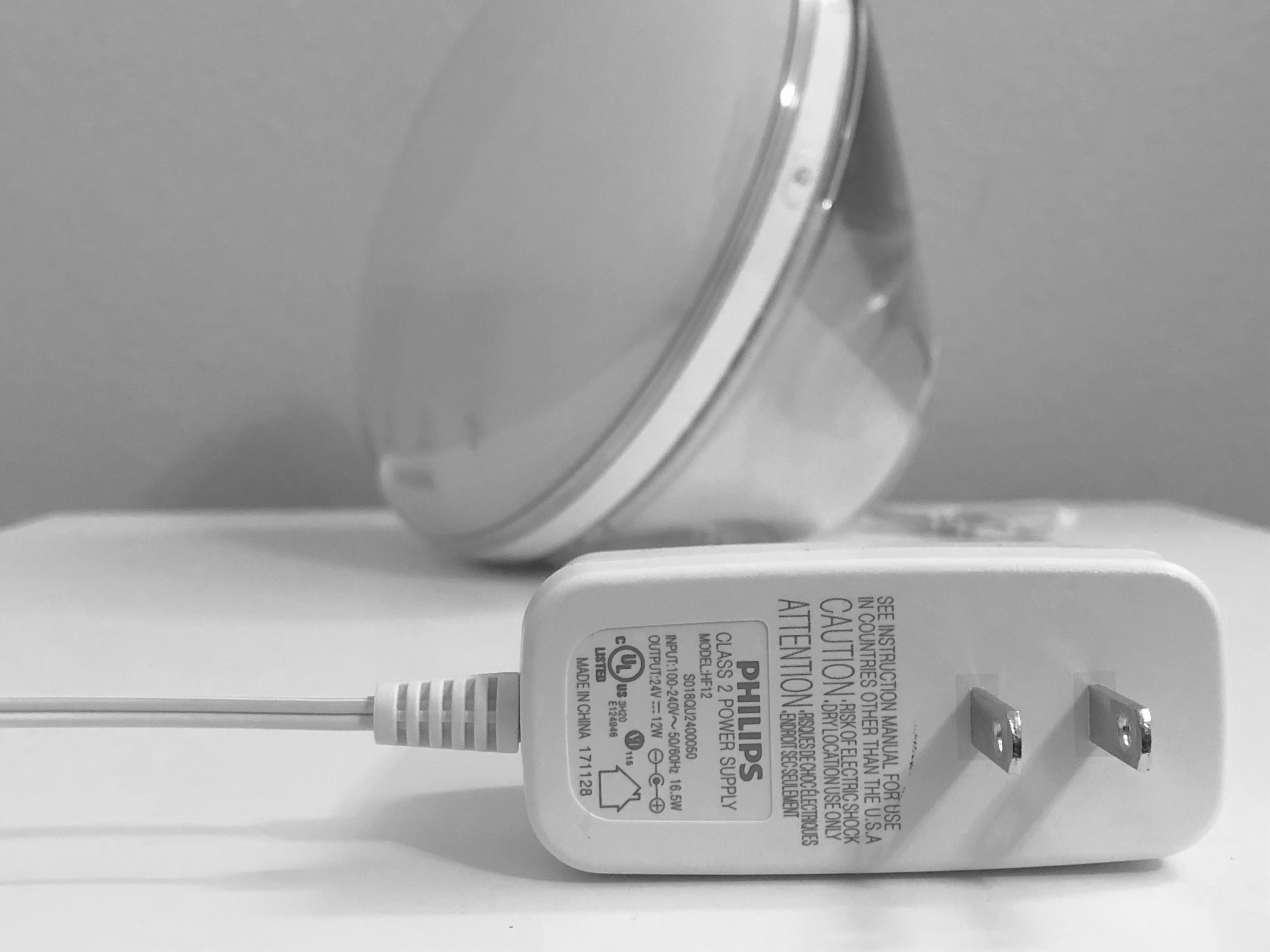
The power adapter is well designed in that the prongs were placed on the same axis as the adapter itself. Doing so saves a lot of space in the outlet once plugged in, and is a wildly appreciated design touch in a world where power adapters use one, but take the space of two (sometimes three on an outlet extender) outlets. Where a design choice falls short is the use of two strand wires adhered together instead of being encased in a cylindrical or fettuccine cable. For those unfamiliar, your phone charger, while appearing to be one cable, actually houses several wires inside. Same with your wired headphones (some Beats headphone cables resemble a fettuccine noodle, hence the name I use. This combats tangling). Cables have been this way for several years now, and Philips’ oversight in shipping a power adapter with strung together wires as such strikes me as another example of this product having one foot solidly planted in the past.
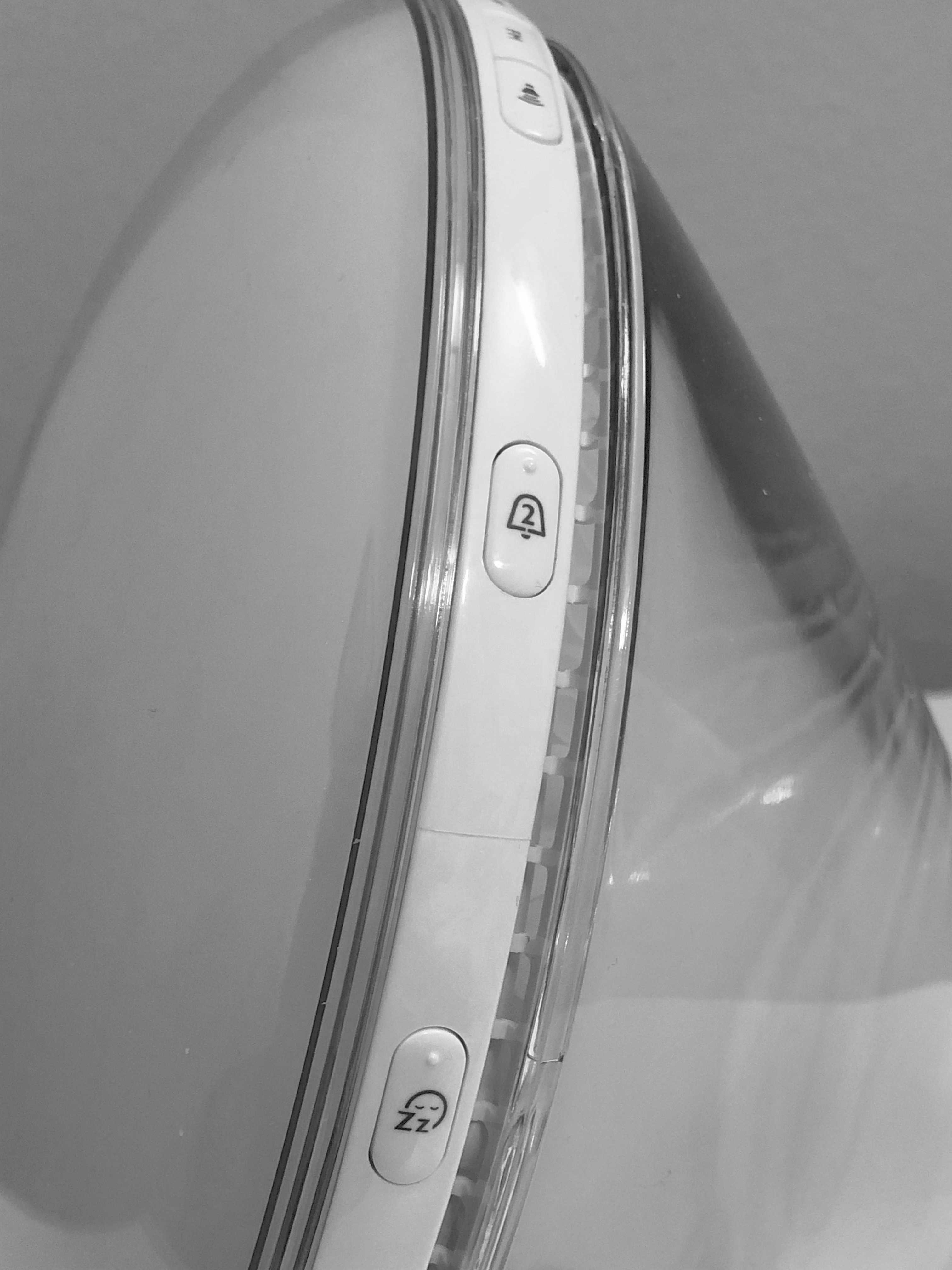
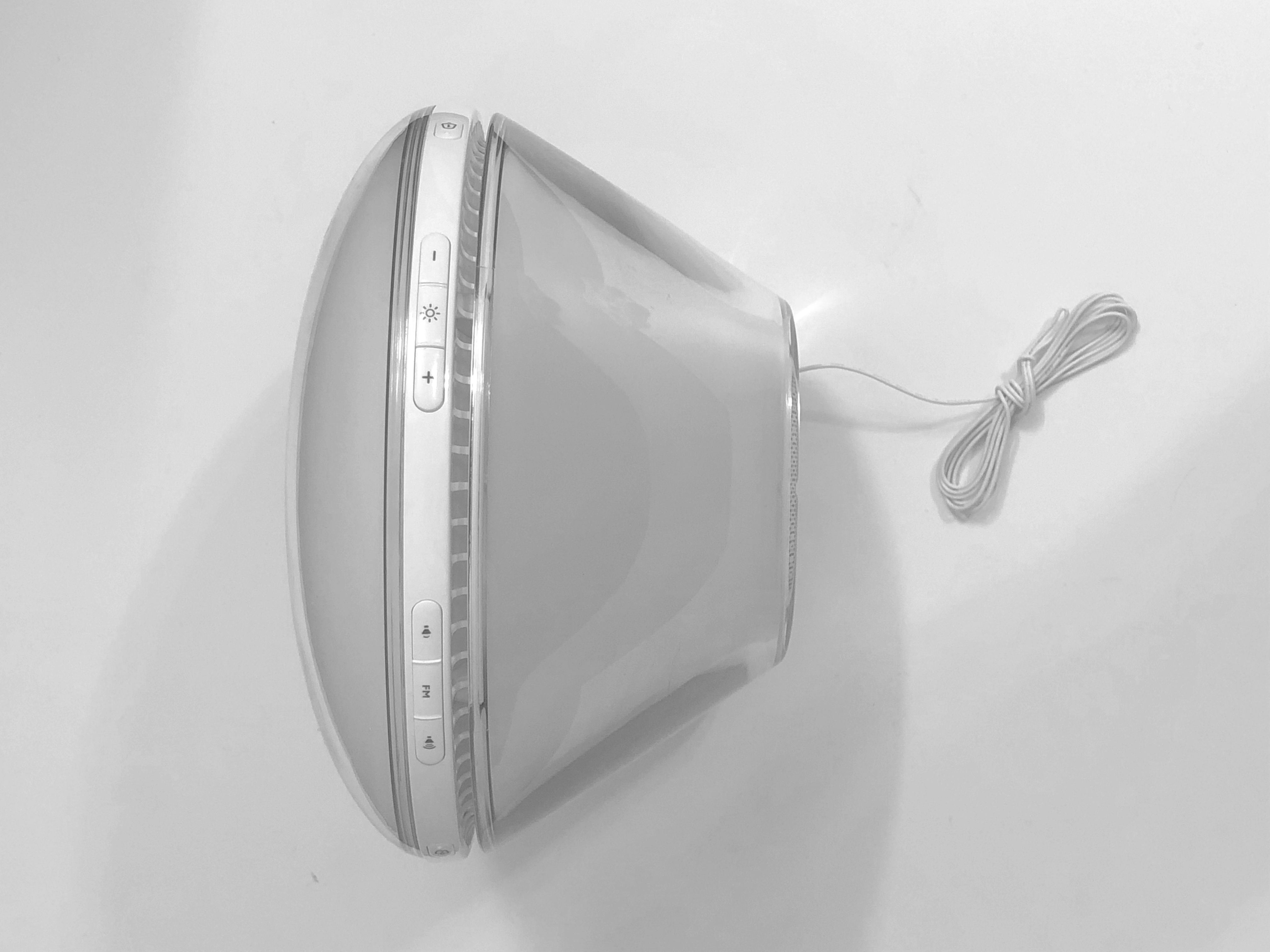
I have a tumultuous relationship with the buttons on this device. But before that, just take notice at the two visible seams (one on the white plastic between the buttons, other below it on the transparent plastic). Take notice at the seemingly unnecessary perimeter venting as well (this device does not need that kind of airflow). I’ll let you formulate your opinions on those subjects. Now onto the buttons. First, facing this clock and using the buttons is impossible without muscle memory and plain old memory itself. Either you memorize the button layout and use the bumps on some of them to navigate your fingers around, or you get up and move your head around the perimeter of the clock, searching for buttons (very likely in the dark, where they lack even the most basic of illumination techniques such as glow in the dark radium). Unlike the other aspects of the clock, the buttons are very cheaply constructed, giving a very hollow click when pressed and wobbling around in place. Unfortunately, instead of consolidating all input in one place, there are more buttons (this time, touch-sensitive) on the front face of the clock (where they all should belong actually).
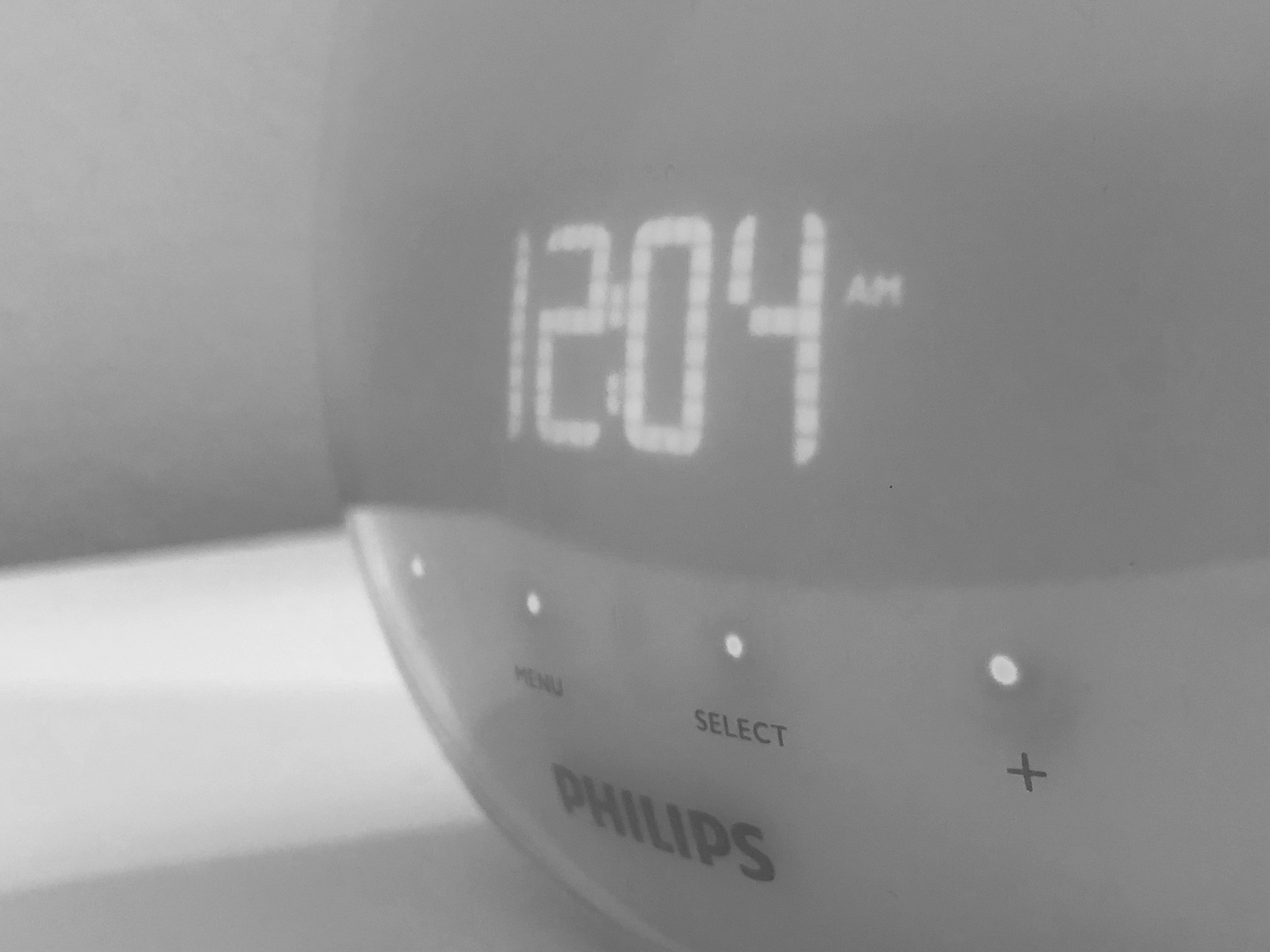
A cool design touch is the illumination of the buttons as your finger approaches them. This is made possible I’m guessing by cranking the capacitive sensitivity of these buttons up to an 11. Unfortunately, this is also made useless as the button titles are not illuminated. Remembering which button is “menu” and which is “select” is not a task I expect to do on my $140 alarm clock. Another example of where user interaction falls short is having to hit the “+” button 30 times to set my alarm to 8:30 AM. Perhaps buttons are not the best mode of input for a device such as this. Also visible in this photo is the digital clockface, which would be fine were it colored white and the time was the only thing it was displaying.
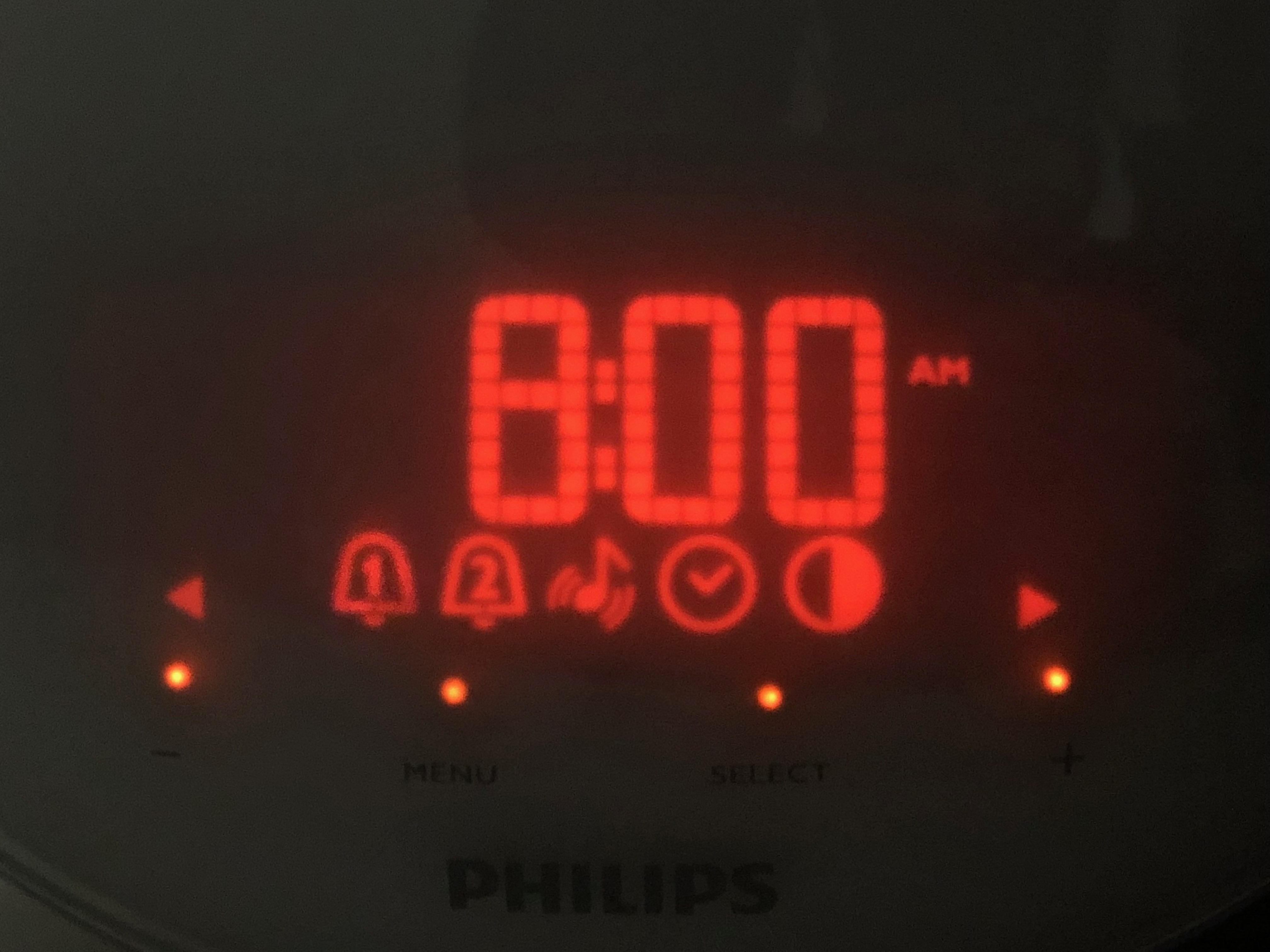
However, it is an ominously glowing red that in a dark room at night bleeds beyond the lit up portions of the clock face. Instead of being a potentially cool-looking matrix LED setup, the display has precut shapes for the icons that strongly resemble the hunky black plastic bedside alarm clocks from the 90s. The LEDs used to illuminate the buttons below are for some reason a distinct color from the clock face. A better-suited display would’ve been a front-lit, touchscreen e-ink panel. Such a display would remove pretty much all non-essential buttons from the actual housing of the device, add more interaction models (such as sliders for volume or alarm time), and look much more elegant (a glowing monochromatic display versus an 80s themed seven segment display, you decide). The quality of the image I embedded reflects my displeasure with such aspects of this product.
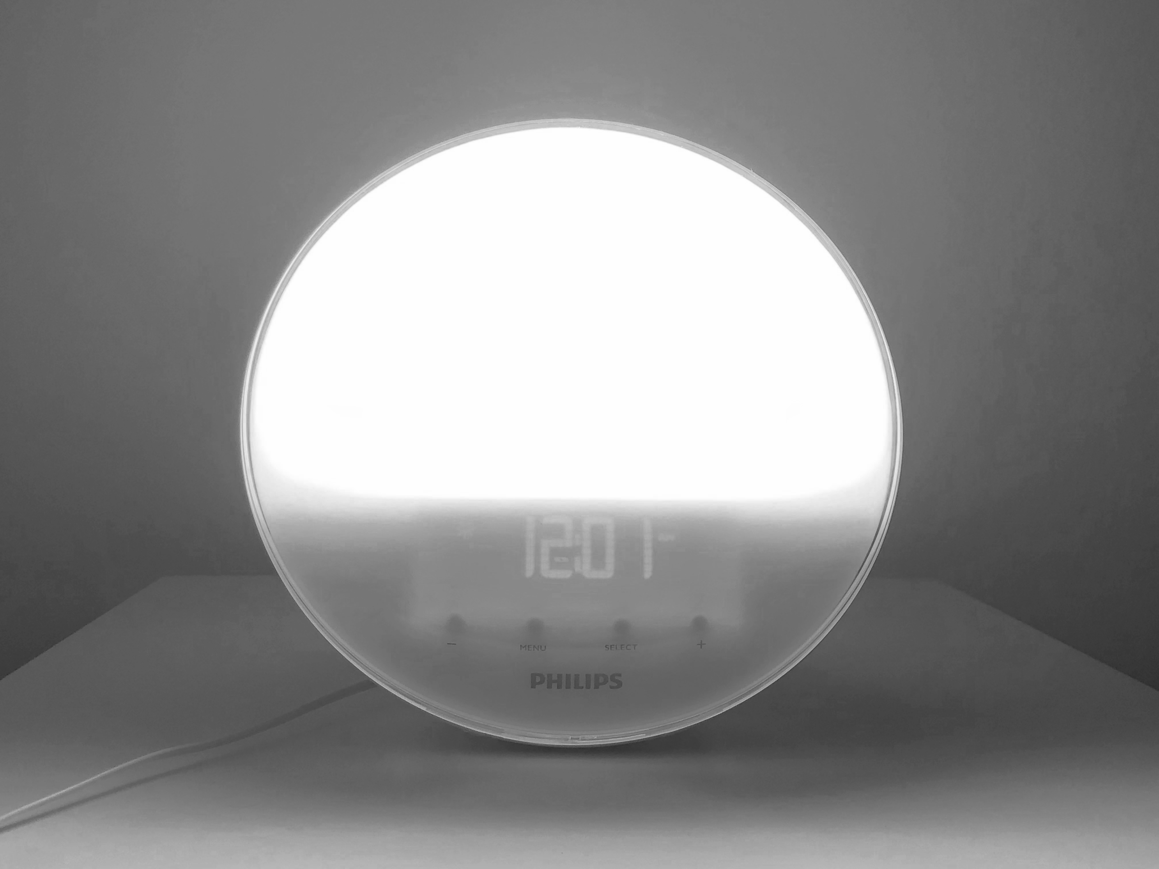
Again, the product is handsome indeed. At first look it certainly does not look like any alarm clock that precedes it, resembling the Sun itself. I’m sure that was the motif. The plastic acts as a wonderful diffuser, with no semblance of bright spots or light leaks from the main bulb itself. Some things Philips wholeheartedly nails, and the execution of the light is extraordinary, transitioning between, red, orange, and finally a warm white as smoothly as possible.
In the end, the Philips Wake-up light is what it is. It’s what you get when a company focused primarily on lighting decides to make an all-in-one consumer electronics product. This is a product that does not know daylight savings time exists, and when unplugged forgets what time it is. This is not a product born out of competitive Silicon Valley tech product culture, and there is no Steve Jobsian dictatorial figure at the head of it all shelving products and disbanding teams because of one small detail. Today, the clock seems to have been discontinued in all sense of the word except production and distribution. Years have gone by with no major updates to the line, and with Philips aggressively pushing their Hue lights, sunrise wake-up has been rolled into a bullet point feature rather than a headliner. The whole saga reflects the ongoing assault on specific-use consumer technology. In a world of multifunction devices, Philips had access to a specialized technology not yet completely commercialized as an iPhone app. This is what has come out of it. The reason the Kindle has been able to survive is impeccable engineering, innovation, promotion, and support. Opting instead to stagnate their product and selling it at full price years later, Philips has done a disservice and dished an insult by forcing users to purchase Hue bulbs, a Hue bridge, and use a mobile app to have their upgraded experience of a wake-up light when a single self-contained product was serviceable in the past. Perhaps we are doomed for this complexity that is shrouded in the false veil of simplicity, where our product ecosystems merge and complicate our lives, while companies eager to sell us this vision of the future promise the exact opposite.
Update:
Sitting around my room with nothing better to do and a spare USB LED lamp, I decided to scrap together my own version of the wakeup light. Now, this takes into account absolutely none of the criticism from above, as this was a project with essentially 0 budget and completed in roughly an hour and a half. It is more of a fun little experiment that replicates the basic functionality of the alarm clock that the multibillion dollar Philips corporation came up with, and you can build one too with a microcontroller such as an Arduino, a transistor, and a USB powered lamp. Below is what it looks like.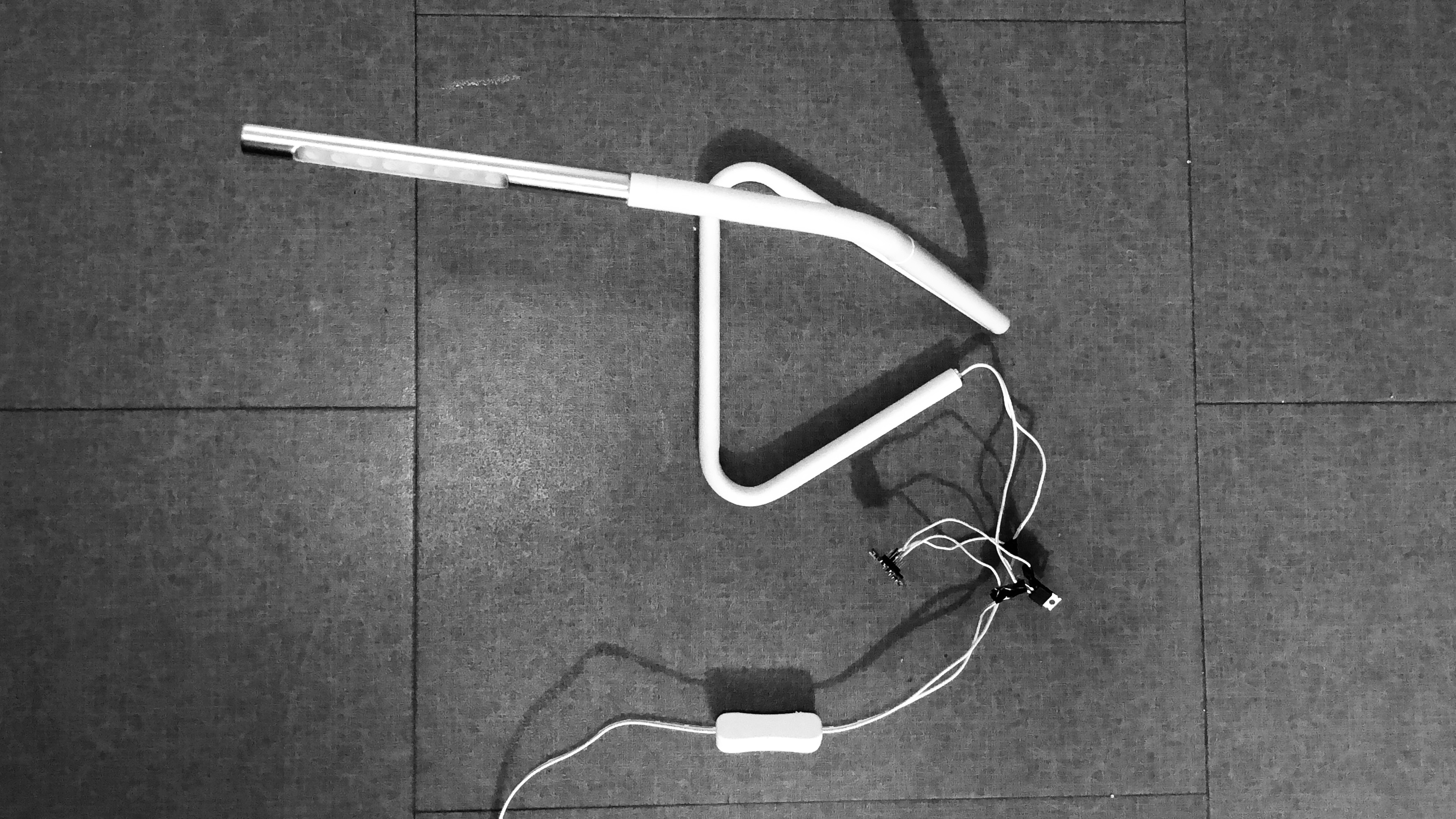
You can find my code and a circuit schematic I drew up in Microsoft Paint on my Github.