Redesigning Publication Database Sites
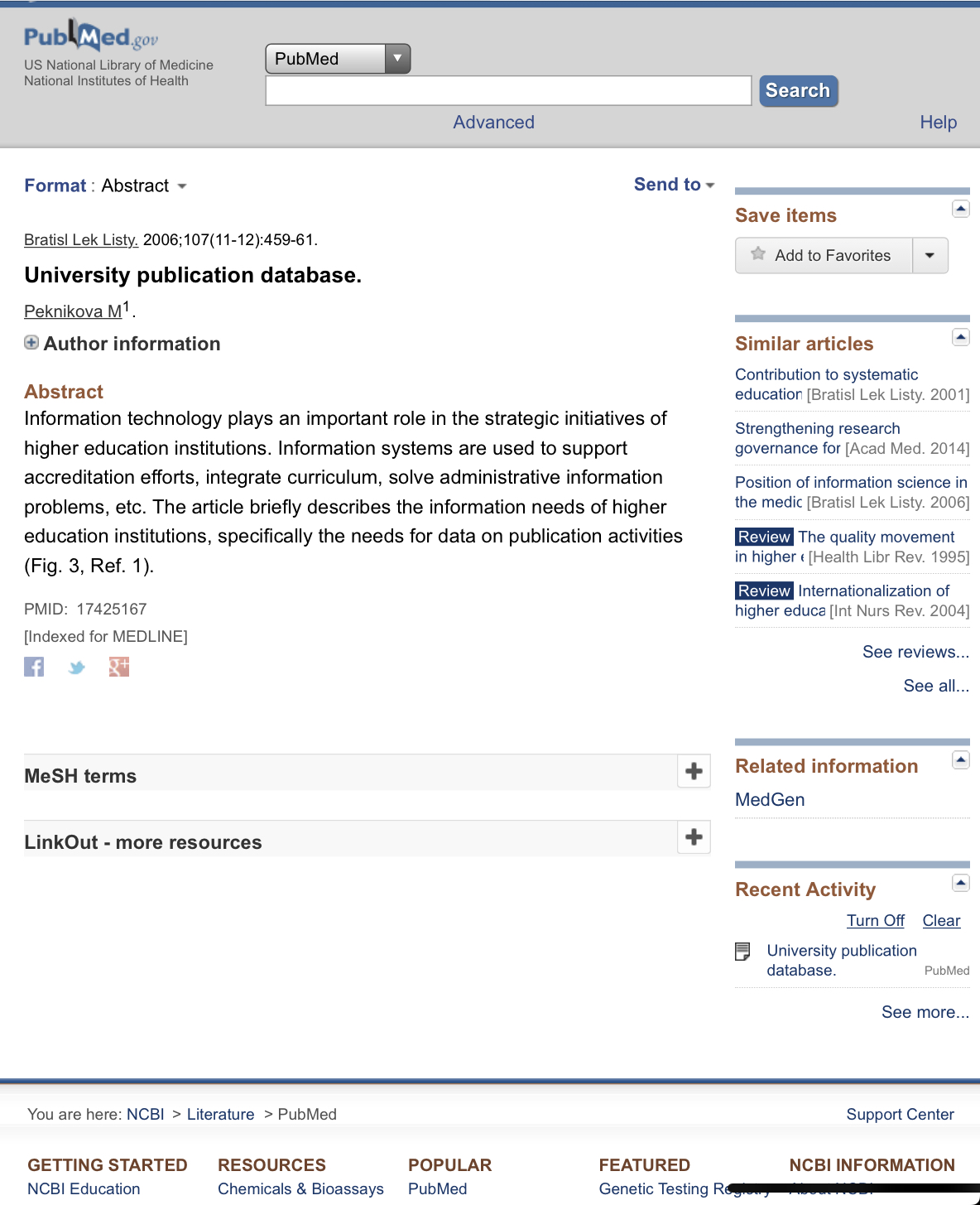
Many scientific publication hosting sites have incredibly outdated, frustrating, and aesthetically unpleasant user interfaces. This is usually out of no desire/need to update such sites (those that use the tools, know the tools). A notable exception is Google Scholar, which aggregates publications from across the internet into a relatively streamlined tool.
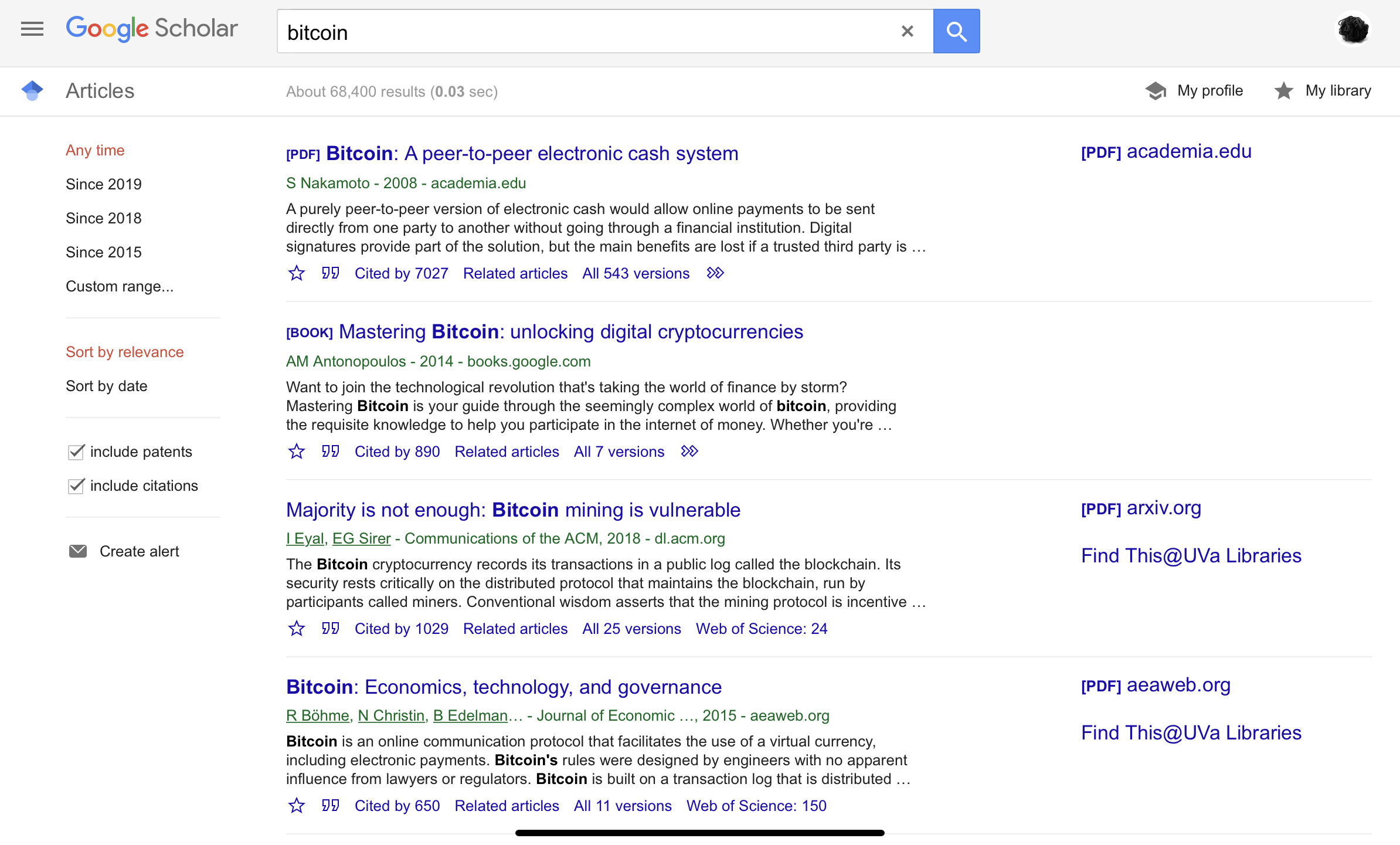
Search, as usual, is the heart of Google’s product, with filters off to the side and the results being the center piece, but is there way to make this interface more inviting, and bring modern features into the interfaces of the other, more antiquated publication hosts?
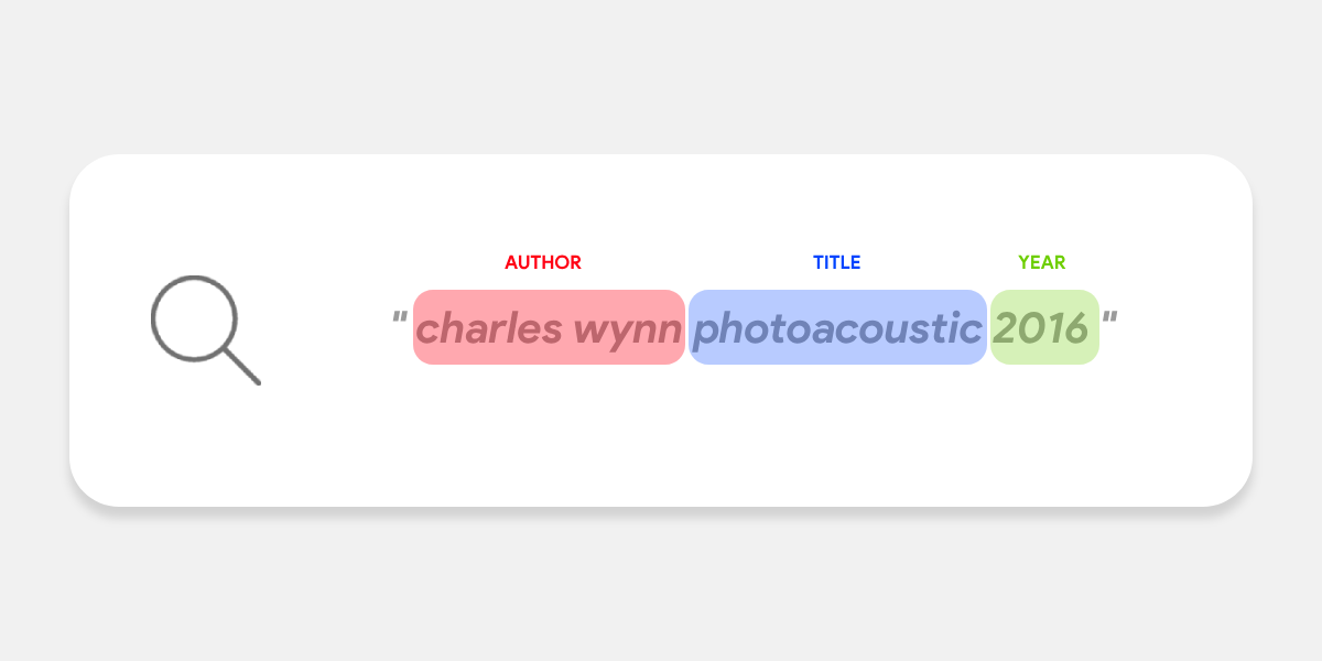
One thing I have been most intrigued by is natural language processing, and parsing text for further analysis. For a publication database, it seems as if the main method of interaction is text input, where the user seems to know pretty much exactly what they want rather than go on a journey of discovery to find a paper to read. From the publication databases I visited (except for Google Scholar, which of course they nailed their method of search/text input), most were relying on multiple text boxes and filter options and tons of unappealingly complex input types. The single most beneficial element on a publication database would be a search box armed with AI to parse text into filters automatically for the user. Imagine having a universal search box that knows whether your input is a name, a year, or a DOI number! So I designed an entire UI for such an application, where search is front and foremost, that was designed with NASA in mind as the publication host.
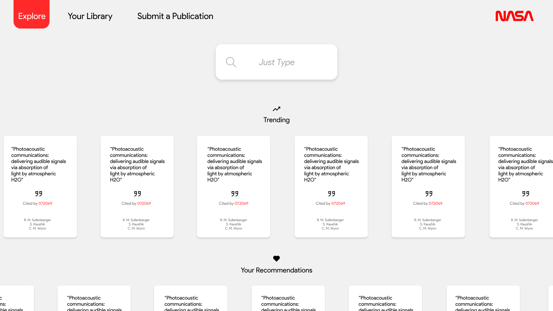
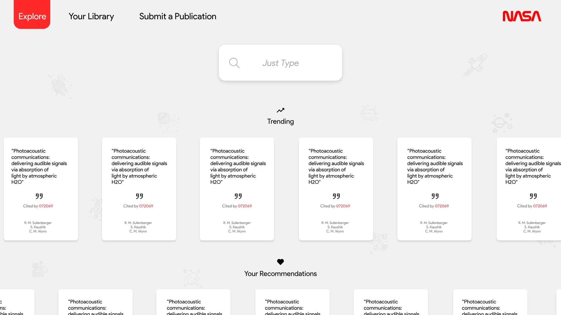
Here you can see how prominent the search box is, and how the placeholder text invitingly says "just type" instead of something more traditional like "search database". I believe little things like that are important. There was no way to get around a header, so I tried going for the least obtrusive one (one that would be lacking a solid colored horizontal bar across the top of the screen). The links float, and the active link follows the color of the logo on the far right, which thankfully gave me an accent color to play with. The logo really balances out the top right of the page well, despite having no interactive elements there it certainly doesn’t feel empty or plain. Most of the interactive elements have drop shadows, to signify depth on the page and the fact that they are actionable elements. I use iconography in a few places (search, citation, and trending/your recommendations) for clarity and avoidance of what is traditionally an extremely text heavy type of website. Publication sites don’t have very many pretty pictures! Text colors on the publication cards vary, black for the most important, light gray for secondary info, and red for standout information (in this case, the number of people who have cited that specific publication). Also, notice that the UI scales very well for the desktop web, but it appears very touch friendly too. Large touch targets!
I have a love/hate relationship with solid color backgrounds. Love because minimalism is great, hate because it seems TOO bare. The alternatives are often tasteless, such as extreme gradients (although can be done well!), or full background textures or images. A happy medium I found was using a line drawn icons that are only slightly darker than the background color (to be an accent rather than a distraction). This however gave it a slight children’s daycare website vibe, so I experimented with a slightly more sophisticated version of it below, which retains the solid color for the background of the page, but adds iconography to the main card elements.
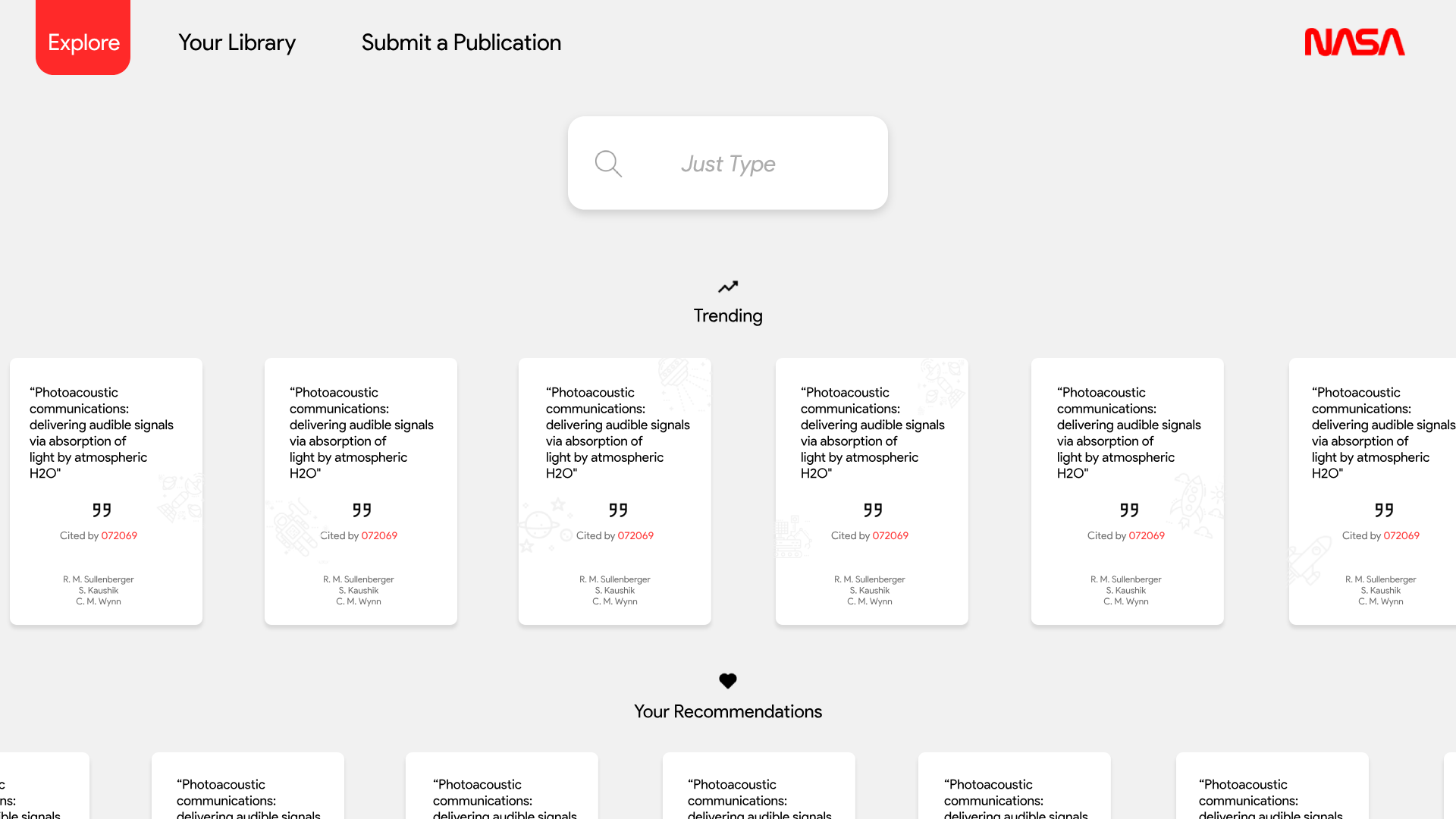
So here, the publication cards have the line drawn icons on them. I think it looks great, and all the cards on the page could be programmed to have different icons (so in this example, 6 cards are shown, create twice that much and with each scroll you dynamically change the cards that are hidden from view and about to appear into view change their icon behind the scenes. This way, the user never sees the same icon twice in one screen. Another cool idea would be parallax scrolling (both horizontally and vertically) between the icons and the cards.
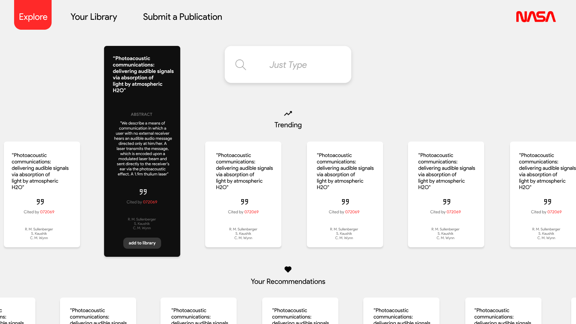
This expands on the UI by introducing a "quick peek" interaction model, either activated by a hover or a click. This lets you dive a bit deeper into the publication (shows the abstract and gives the option to add to your library). Inverting the colors seemed to me to be a good aesthetic choice and one that makes it visually evident which element is being interacted with.
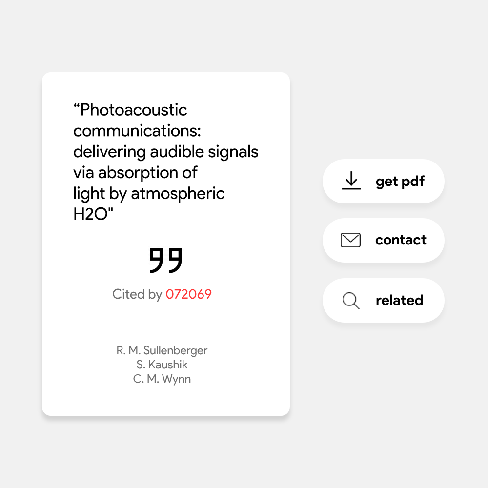
These action buttons are elegant and could present themselves on a hover or click as well.