Envisioning a Student Information System Chatbot
Making a webpage with limited content/UI is always a challenge in the sense that too much whitespace looks unsightly. This limited content may be a massive list you have to scroll through (in this case), but limited by the small amount of data expressed for each list item. How do you make a pleasing UI where all you have to do is scroll through a list and select an item? This is of course easily doable for screen sizes such as a phone perhaps, but when your core audience is people viewing your content through a widescreen Chrome window, this becomes very difficult.
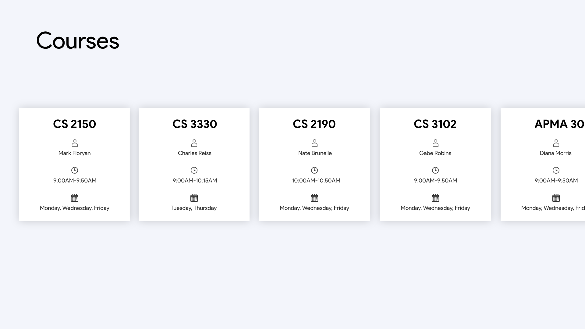
The norm is to have lists be vertically scrolling, of course. This makes a ton of sense when your content is heavily horizontal spanning. That way, the maximum screen real estate can be utilized. In this situation however, I had to work with text-only data points that don't quite take up much space. As you can see, there are only 4 distinct text boxes per element in the list to be scrolled. Having this scroll vertically would be a tremendous waste of horizontal. It's clear that horizontally scrolling would be the way to go, but what is the best way to take advantage of all that new gained vertical space per element?
Iconography and its effect on easing cognitive load for processing data needs no explanation. It was clear that for better comprehension of the data as well as a aesthetically appealing look, icons would have to be employed. In this case, I opted for line-drawn icons instead of filled icons, for aesthetics and the discomfort I feel when seeing a filled icon that is not a button of some sort. Optimal padding is present, to give each data point ample breathing room (and to liberally use all that vertical space). The use of shadows helps establish depth and layers to the page, and of course typography establishes hierarchy (large font size for the title of the page, small but bold for the card title, and regular and smaller for each data point in the cards).
The moral of the story is that side scrolling is a fantastic tool in the utility kit for a web designer, one that is criminally underused perhaps since people are not used to it or that scrollwheel mice are physically designed to scroll vertically (however many people still using those, but hey that might be your core audience). Especially in a situation like this, horizontal scrolling is an efficient use of screen real estate and looks fantastic.
You can find all the code for this side-scroller on my Github